Some Recent Projects
Below is a sample of what I’ve created. Give me your challenge – I’m ready to rise to the occasion.
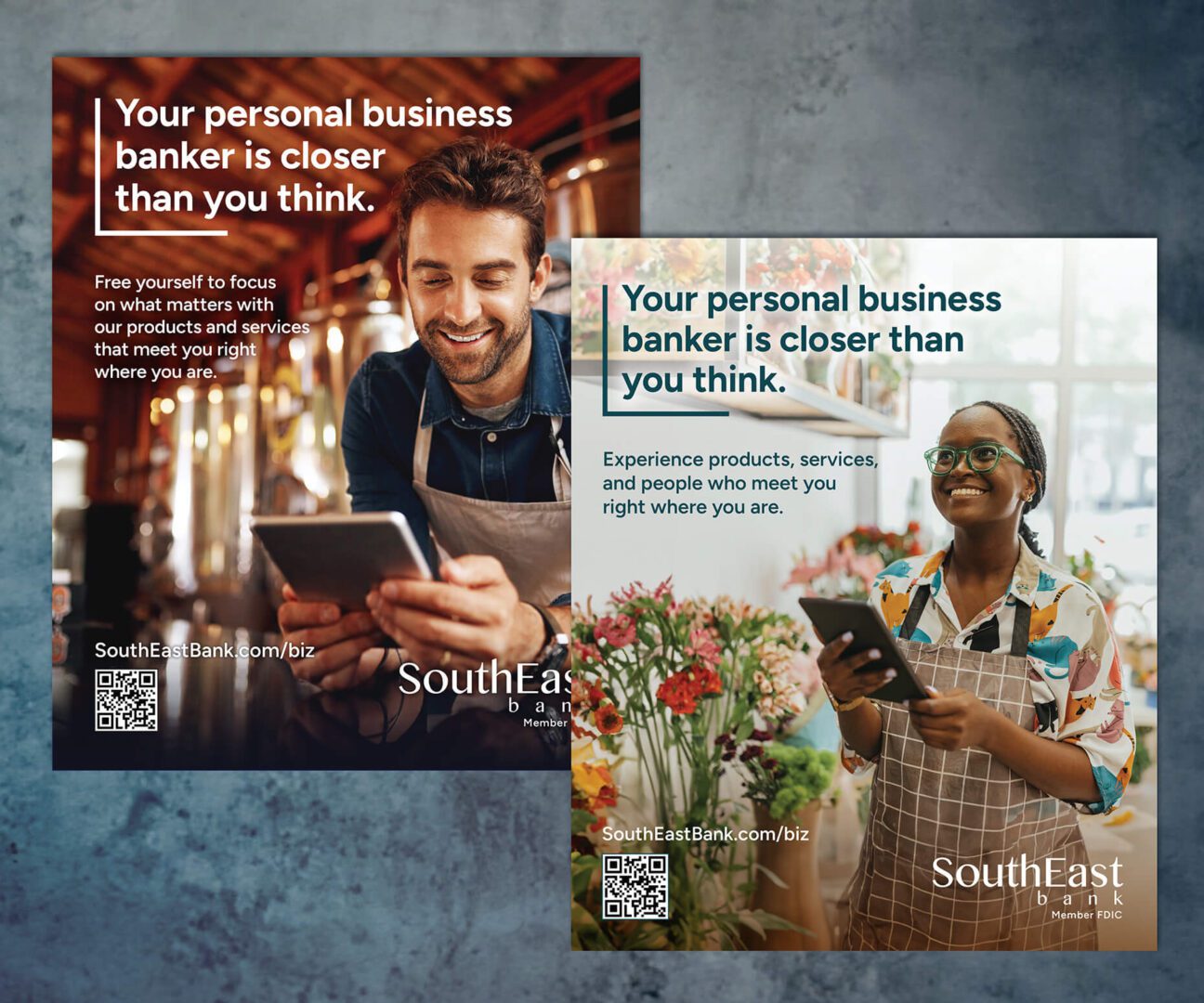
Challenge: As the first in-house designer at Southeast Bank, I inherited a fragmented visual identity created by various vendors. With no established brand strategy, I was tasked with creating a cohesive system that honored the existing logo and green/blue palette. I also discovered the tagline “good to know” was already copyrighted by another company.
Solution: Working with legal and the CMO, we developed flexible alternatives—“we’re good to know,” “it’s good to know,” and “that’s good to know”—to preserve the message in different contexts. I partnered with a copywriter to craft a brand voice and designed a visual system that reflected the bank’s friendly, community-focused atmosphere, replacing the previous heavy black aesthetic with a lighter, modern look.
We launched a refreshed identity built on trust and clarity, using clean layouts, bright whites, and blue/green accents with premium print finishes. I documented the new style in comprehensive brand guidelines, including updated fonts, an expanded color palette, photography, and icons.
In-branch materials and digital monitors displaying advertising and information to support Southeast Bank product and services awareness.
Frame 1: Pull-up banner, and an example of a large screen rotating ad.
Frame 2: Examples of some of the additional banners in the series.
Frame 3: To replace a large mix of inconsistent brochures and inserts, I designed a flexible brochure pocket folder system adaptable for both business and consumer banking. It featured standardized, interchangeable brochures and buckslips that could be easily rotated in or out and inexpensively produced for specific promotions and channels.
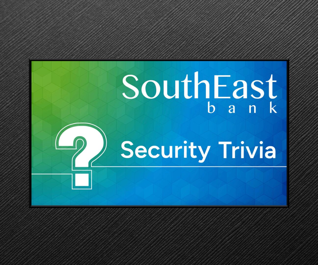
An animated quiz shown on large monitors in SouthEast Bank branches to educate customers on how to maintain the security of their identity, bank accounts, and other online activities.
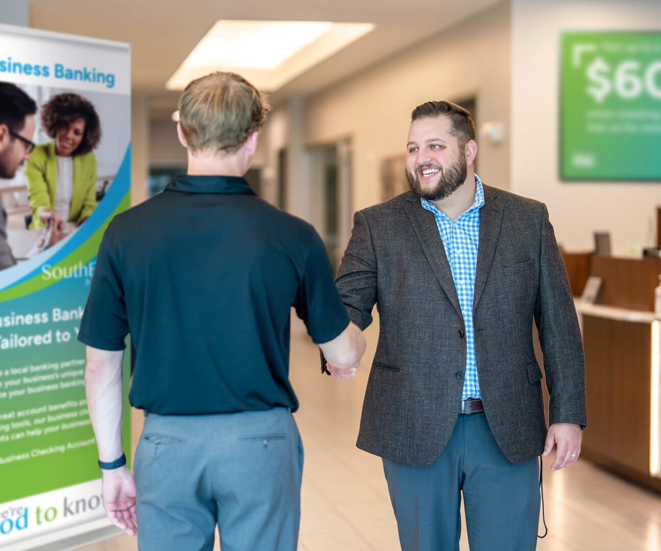
Multichannel awareness advertising of SouthEast’s Bank Business Banking products and services.
Frame 1: Magazine Ads
Frame 2: META ads
Frame 3: Direct Mail – folding self-mailer and postcard examples
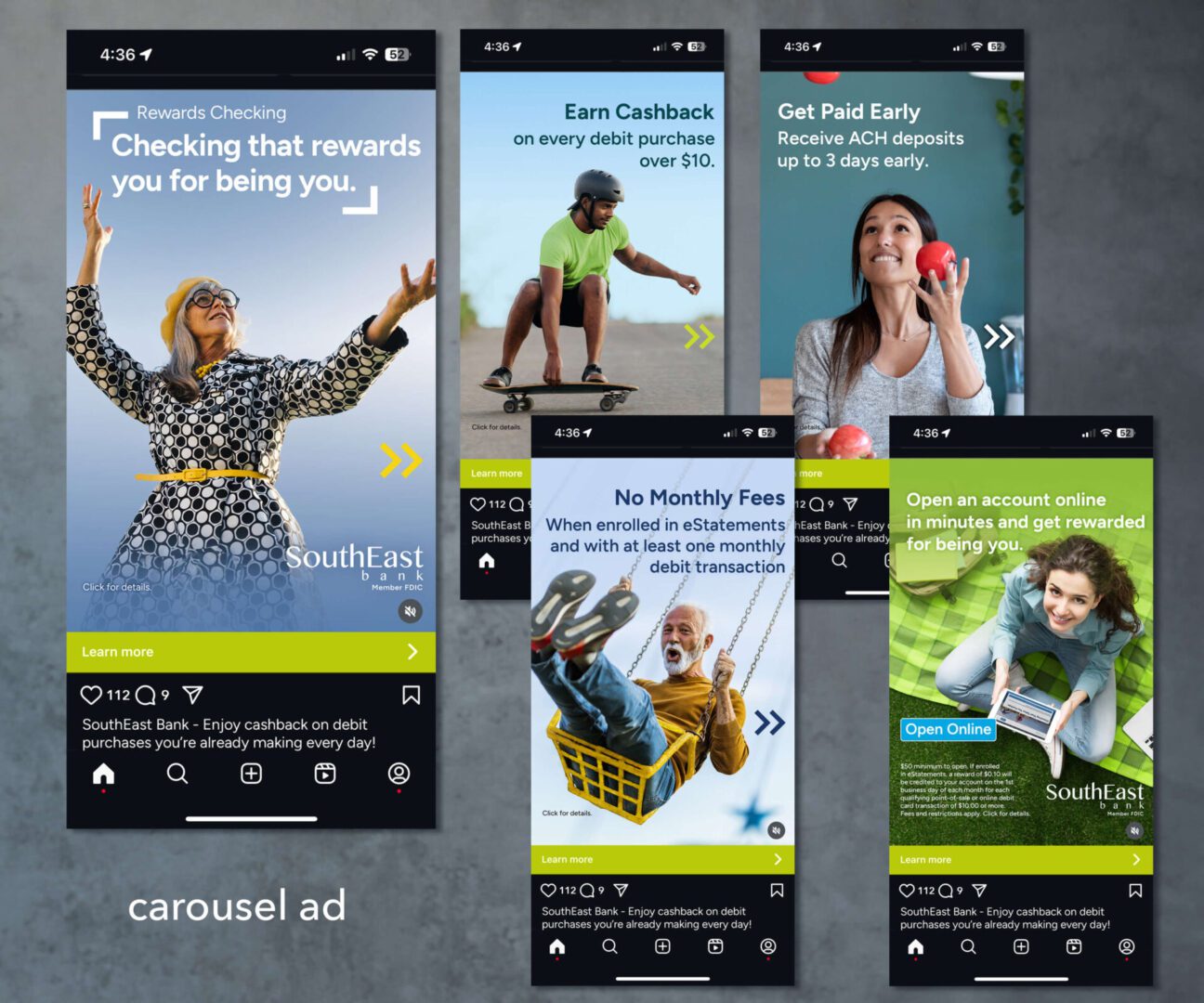
Multichannel awareness advertising of SouthEast’s Bank Consumer Rewards Checking product.
Frame 1: Magazine and META ads.
You can view the animated META ad on my channel here: https://www.youtube.com/@ChristelHimes/shorts
Frame 2: META carousel ad frames
Challenge: Over my 5+ years at Southeast Bank, I worked on branding for many of its products and services. One key project involved aligning Education Loan Finance (ELFI) – previously branded as a separate entity – with the bank’s core identity. To appeal to current college graduates and parents, the goal was to give ELFI a more progressive, energetic look while establishing its connection to the bank.
Solution: Creating an entirely new logotype and branding system for ELFI inc. – the renamed parent company. I chose and tweaked a modern, bold and clean font as a base. I then added a sense of “dynamic playfulness” to the mark that I noticed was emerging in the FinTech industry at the time. The customer-facing loan product mark was subsequently derived from there. Common colors and use of the same corporate font (Figtree) help to maintain ELFI’s umbrella association with the bank. You can view the animated META ads on my channel here: https://www.youtube.com/@ChristelHimes/shorts
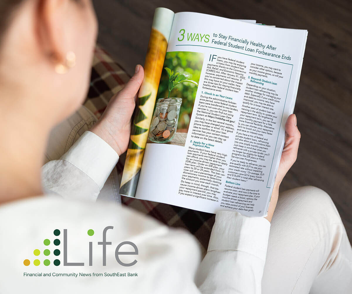
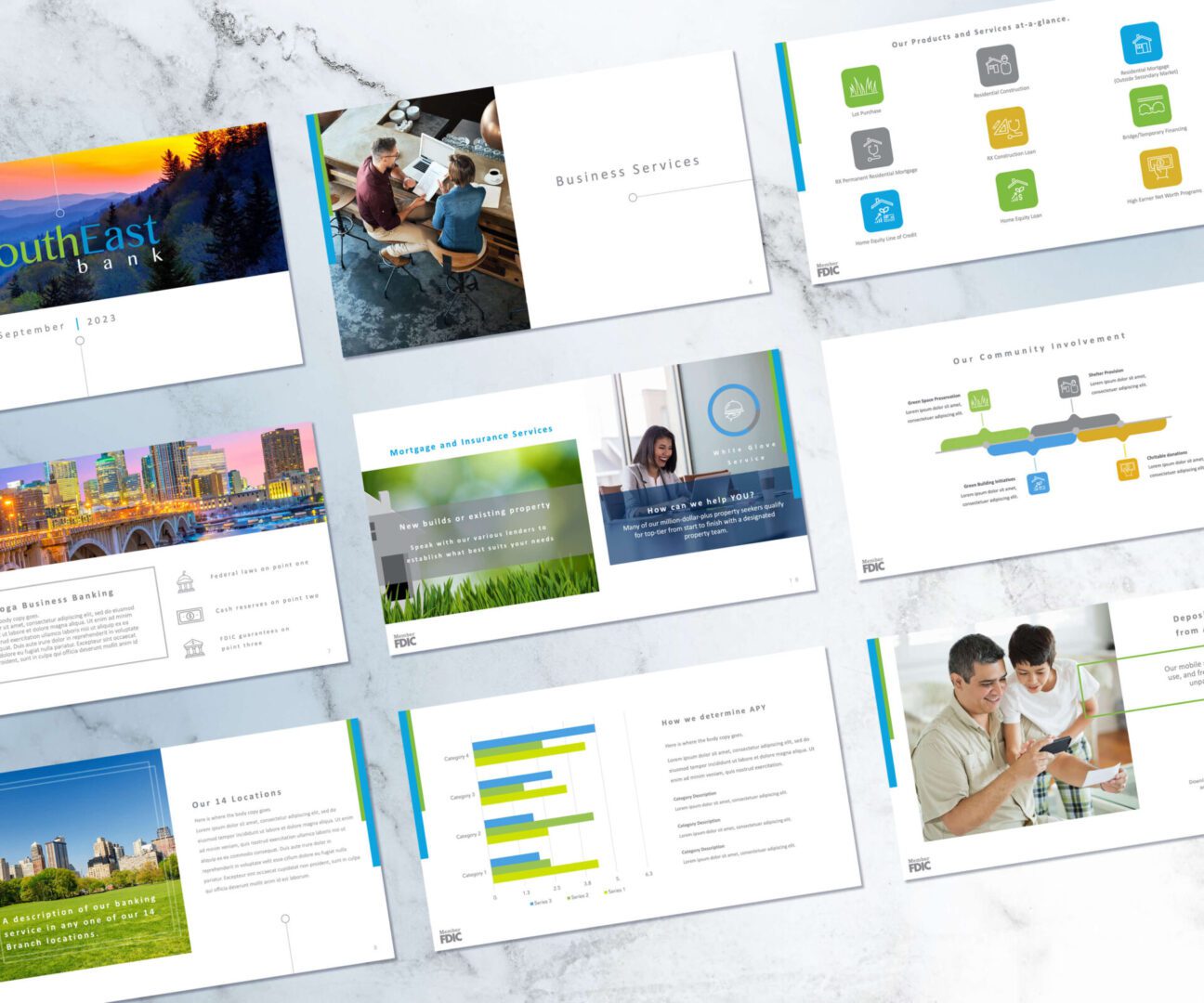
Frames 1-3: Available for free in our lobbies, Life magazine was created to inform customers about banking industry updates, security tips, and community topics. It also spotlighted impactful local individuals and included SEB product comparison charts to help tellers to explain and customers better understand different account type options.
Frames 4-6: Publications for various products and program information. Collected data points were creatively illustrated and also made available on our website in downloadable pdfs.
I loved being presented with a new product or service to brand for SEB! We also had annual group volunteer and fundraiser activities that everyone enjoyed having a theme and mark for.
Frame 1: Marks for bank products. Thrive – a checking account with perks for folks 65+. Max Business – a suite of services for small businesses. Accelerate – a service that allowed customers to receive ACH deposits up to three days early.
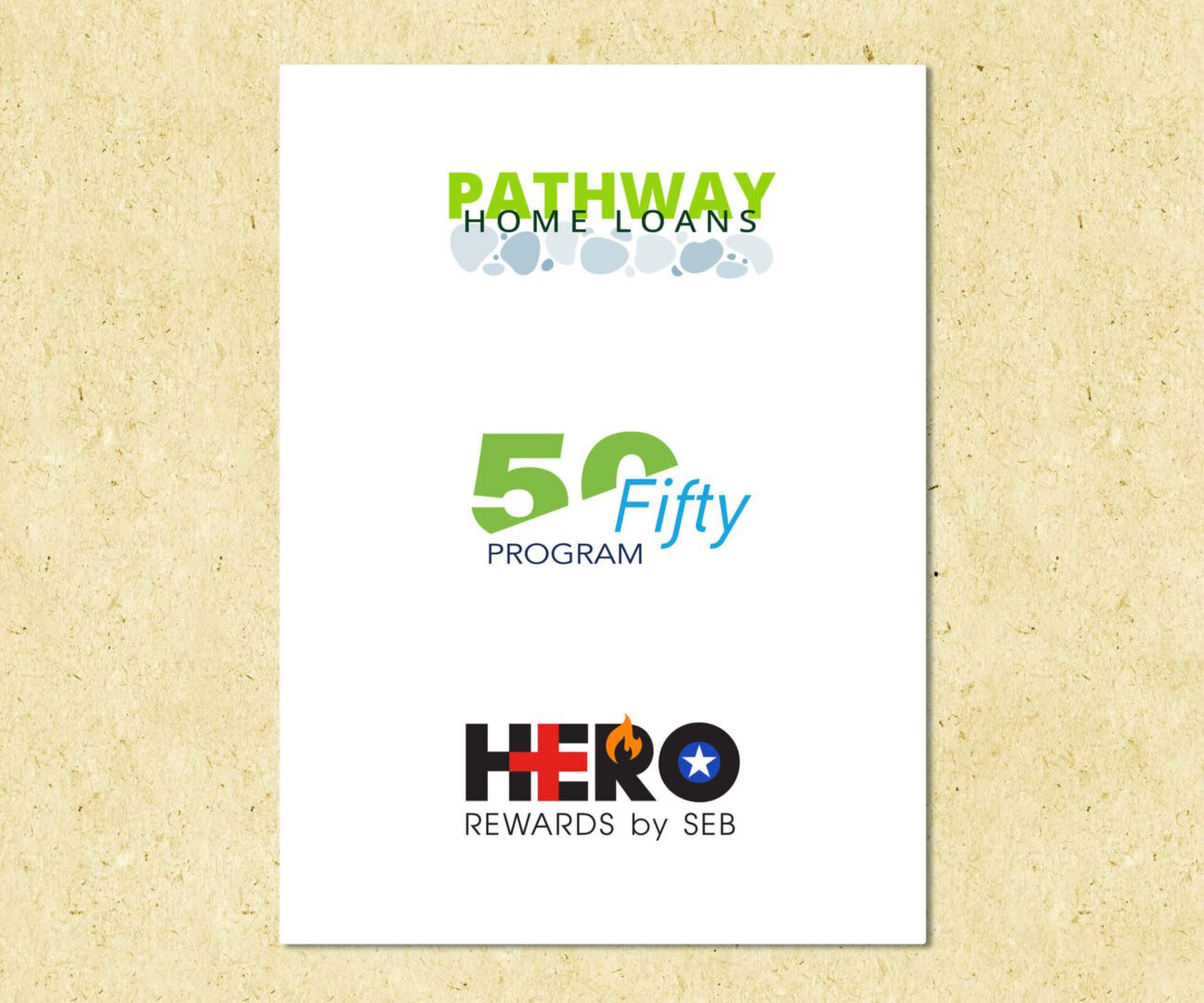
Frame 2: Pathways – proposed home loan program for certain income qualifications. Fifty-Fifty (I convinced the team to go with the name 50/Fifty) – a matching donation program. HERO – a special checking account for first responders (conceived during COVID).
Frame 3: Pathways direct mail postcard
Frame 4: We Invest – The bank’s volunteer and community outreach program. Good to Row – a play on our “Good to Know” tagline became the name of our Dragonboat Race Fundraiser Team in 2024. Loan Rangers – another volunteerism logo.
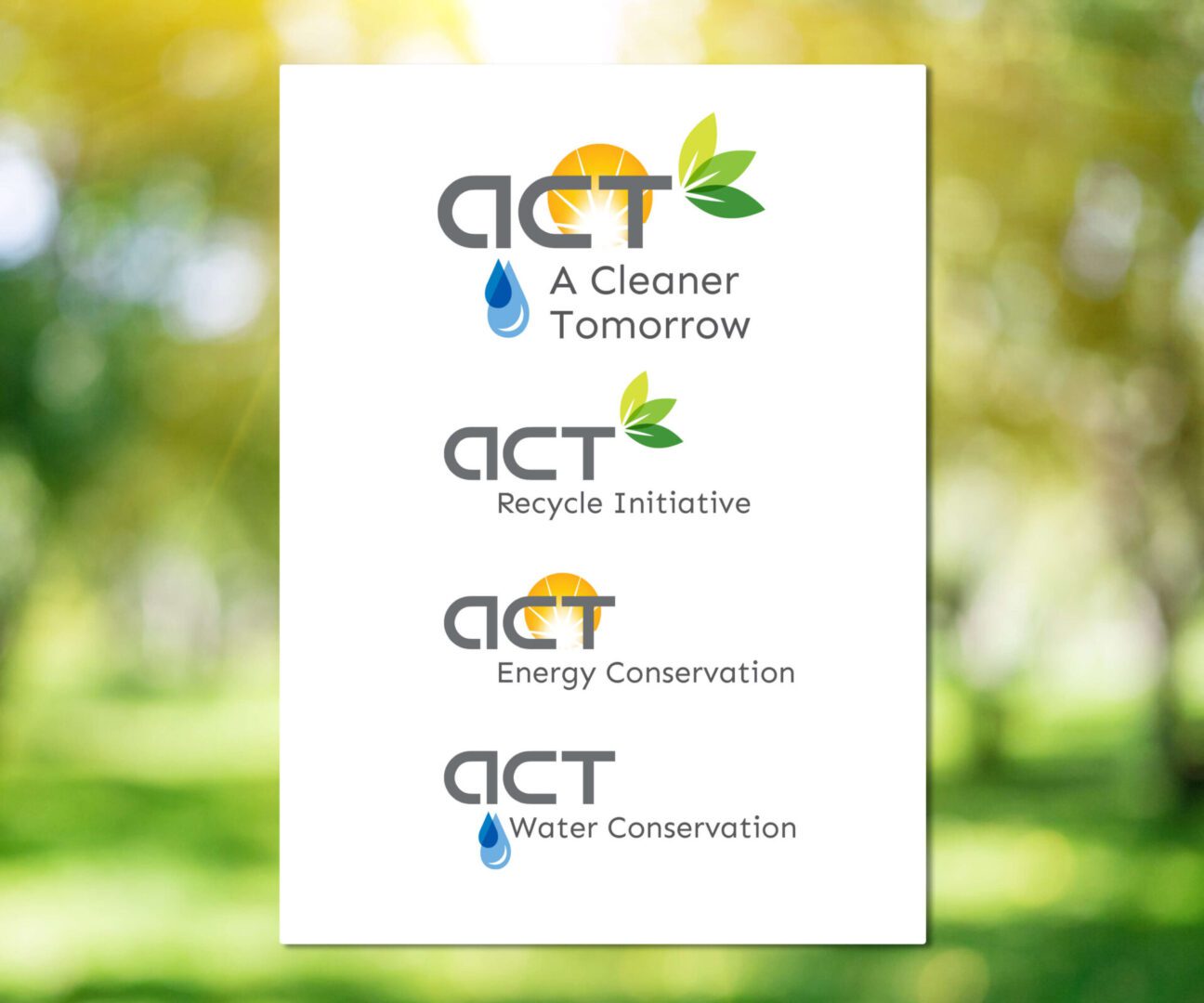
Frame 1: As a contract designer at Jones Lang LaSalle, I developed a modular logo system to visually support their expanding environmental initiatives across properties. The scalable design provided a cohesive structure adaptable to each program phase, reinforcing the company’s sustainability strategy.
Frame 2: While not every client requests a full branding system, I always focus on translating their vision into distinctive, thoughtful logos. These examples were created for various Florida-based businesses as part of freelance projects.
Frame 3: Recent logo work from the past few months: a local faith-based nonprofit, an upcoming club lounge in Philadelphia, and a fiber optic cable company. These projects are still in development and may evolve into full brand systems—stay tuned!
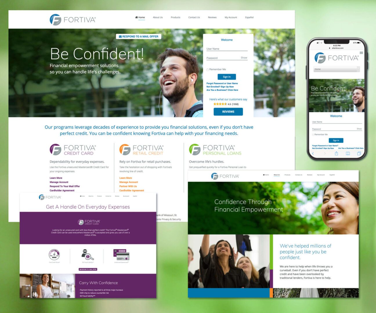
Fortiva Financial offers credit cards, personal loans, and retail credit lines. The VP of Marketing, a copywriter, a UX/UI developer and myself collaborated on a full redesign and relaunch of the company’s website that included WCAG 2.0 accessibility standards compliance. Our team centered the brand’s messaging around one core concept: Confidence.
This positioning communicated Fortiva’s reliability and support, transforming what’s typically a cold financial process into an engaging, approachable experience. Through warm, relatable imagery, clear language, and transparent information on an intuitive, visually engaging site, we created an experience that invites users to explore, connect, and feel empowered.
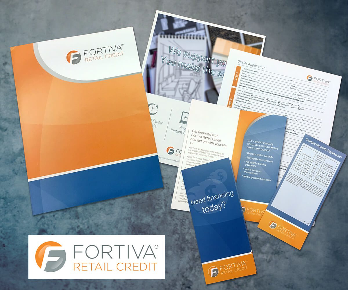
Fortiva Retail Credit is a second-look financing solution that helps partnered merchants offer alternative financing to customers who don’t qualify for prime rates.
The existing sales kit was disjointed, costly, and cluttered with overlapping materials. I redesigned it into a streamlined, brand-consistent package that was both customizable and cost-effective.
Bulk-printed folders, buckslips, and inserts were paired with on-demand, high-quality in-house prints for customized sheets and signage—cutting production costs by nearly 50%. Color-coding clarified usage: Fortiva Orange for merchant-facing materials, Fortiva Blue for consumer-facing, resulting in a more polished, efficient sales presentation.
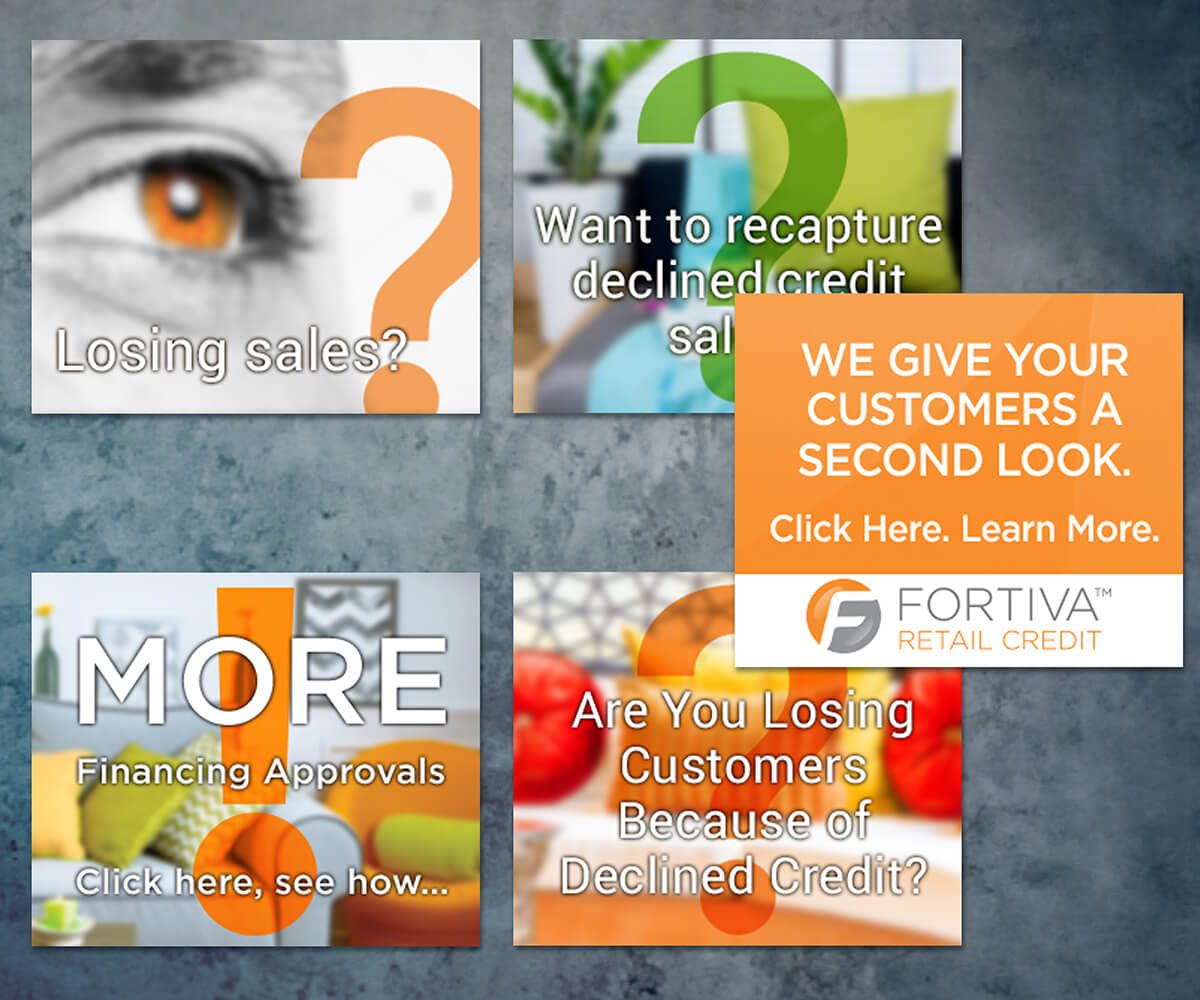
In 2015, Fortiva Retail Credit launched its push into the retail and service financing space—an opportunity that allowed me to collaborate closely with the VP of Marketing on building a new brand presence.
We began with carousel ads in digital trade publications and event sites, using bold questions and clear CTAs to drive engagement ahead of trade shows. Print ads followed, expanding on the Q/A theme across various industry publications.
I also designed all trade show graphics, creating a cohesive experience from digital to physical spaces. The year-long campaign educated merchants on the value of second-look financing while positioning Fortiva Retail Credit as a thought leader. Distinct visual cues—like strategic punctuation, bold use of orange, and punchy, clear messaging—helped the brand stand out and build recognition in otherwise crowded, potentially low-impact spaces.
Atlanticus, parent company of Fortiva Financial, marked its 20th anniversary with a campaign to celebrate achievements and communicate growth to shareholders. I was tasked with designing a commemorative logo, announcements, gift materials, and a complete website overhaul.
To maintain brand clarity, I modified the existing logotype to incorporate the anniversary without creating a separate mark. Gift concepts were shaped by careful consideration of recipient profiles, resulting in thoughtful, relevant items.
The previous website was outdated, non-responsive in design, and visually uninviting. Partnering with a UX/UI developer, I redesigned the site to meet all NASDAQ compliance standards and WCAG 2.0 accessibility standards, while introducing intuitive navigation and responsive design. Visually engaging content told the Atlanticus story, enhanced user interaction, and provided seamless access to third-party provided investor information.
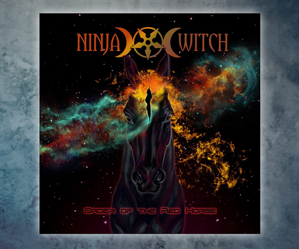
Hand drawn and computer illustrated art and design for Ninja Witch, a Knoxville rock band.
This art is my original concept and no part of it is AI generated or AI assisted. The galaxy arm photo I used was taken by a NASA satellite and enhanced in Photoshop by me.
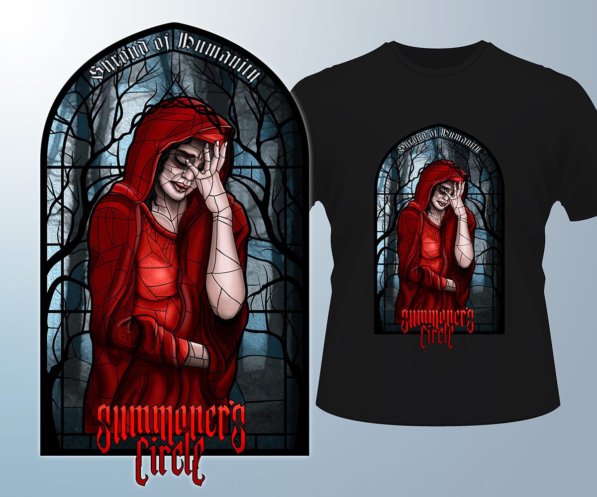
Hand drawn and computer illustrated art displaying different styles that I am capable of. I created this art for Summoners Circle, a world touring Knoxville metal band.
All of this art consists my original concepts and none of it is either AI generated or AI assisted.
Frames 1 and 2: Shroud of Humanity
Frame 3: Thirst of the Vulture.
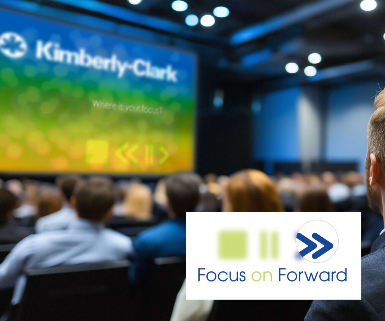
The theme of Kimberly-Clark’s annual sales meeting was “Focus on Forward,” set by executive leadership. My goal was to create a bold, symbolic visual identity that captured this theme and could be applied consistently across all touchpoints—print, digital, and environmental graphics—for the duration of the three day event.
The theme and visuals resonated strongly with the sales force, prompting enthusiastic feedback. One of the results was that additional branded premium items featuring the FoF graphics were requested by many attendees and more were produced even after the event concluded.
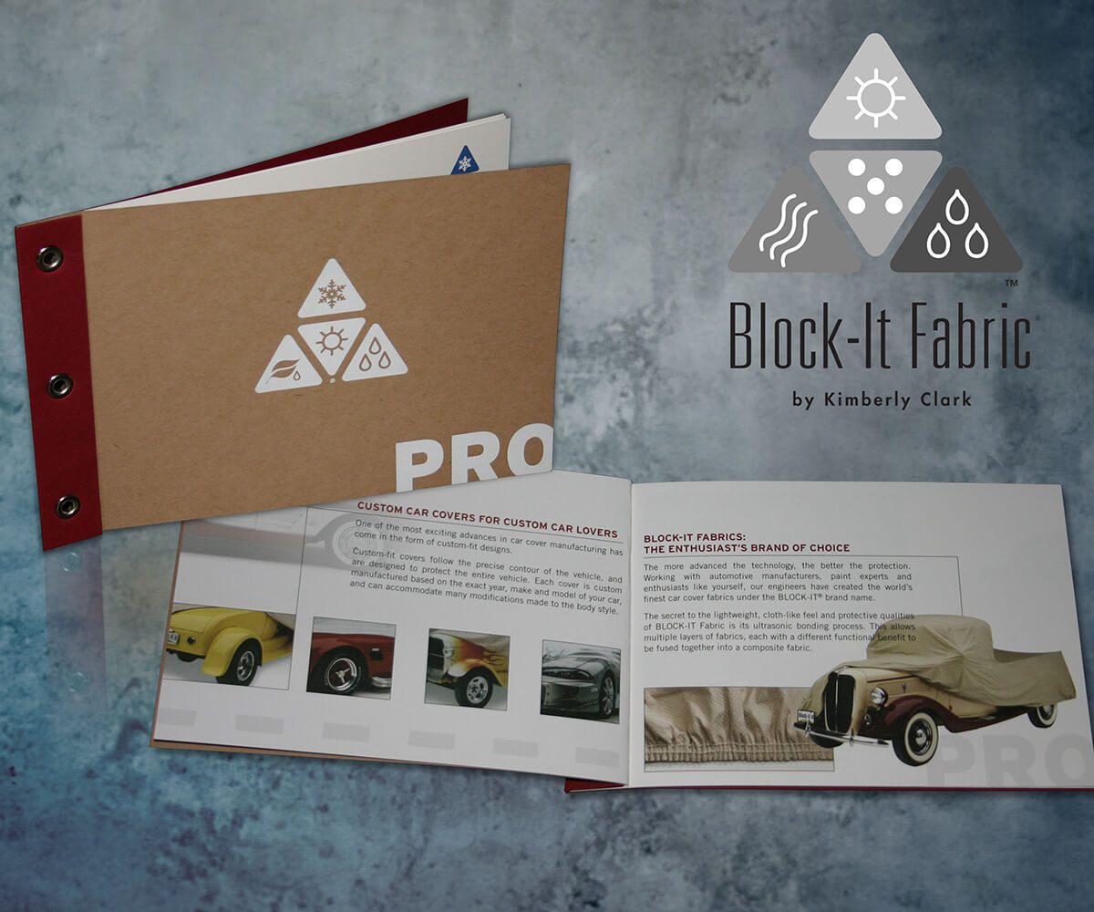
Kimberly-Clark produces a variety of non-woven fabrics used in products ranging from HAZMAT suits to air filters. I was responsible for the creative direction behind three key product releases:
Frame 1: Block-It TM. I redesigned a costly brochure and sample kit for the automotive industry. The new, innovative layout featured foil stamping, a grommeted binding, and integrated fabric swatches. It was more affordable to produce and remained in use for over seven years.
Frame 2 & 3 : KIMTECH PURE®. For a cleanroom product, I co-created the “One Small Step” campaign with my team copywriter. It featured an industry-innovative wipe dispenser that allowed one-handed use while preventing contamination. The campaign included ads with moon landing graphics and audio cards with a custom “One small step…” recording, reaching 5,000 industry professionals.
Frame 4: KIMTECH® Lens Wipes & Microfiber Duster. For this cleanroom product, I designed custom packaging to create a “dramatic reveal” and highlight the new microfiber duster’s use in sterile environments. The campaign introduced the “Pure Genius” branding I’d also devised for this product line.
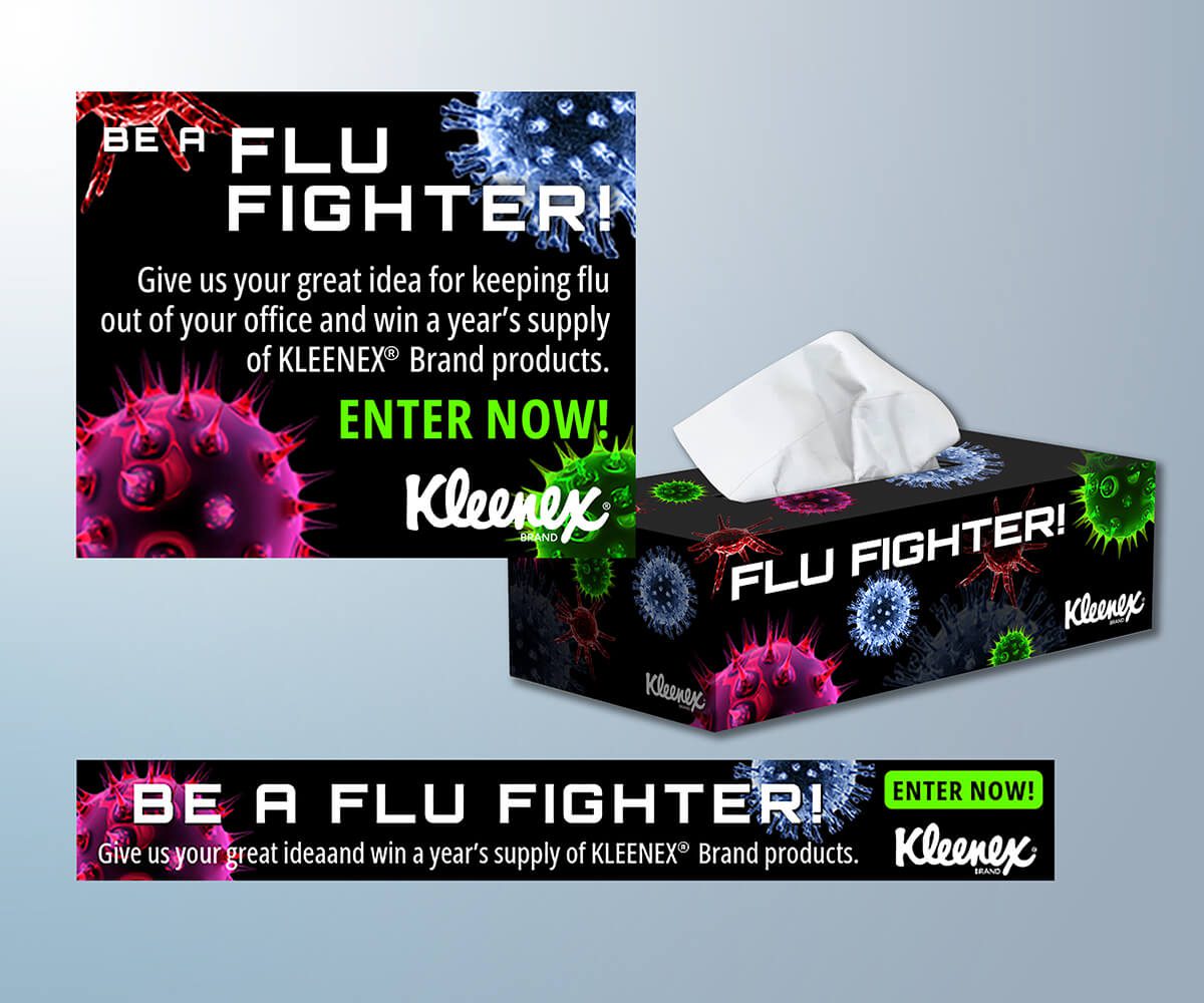
This campaign consisted of animated ads featured during peak flu season on various websites (such as that of the NBC television show “The Office”). They were created for the Kleenex® online presence during Flu Awareness Month.
My concept was to show flu germs as aliens in a dynamic scientific context. The animated germs rolled and rotated around the background of the ads and proved eye-catching within the context of the web pages as a whole. The ads were very well-received – the click-through traffic and contest entry numbers far exceeded client expectations.